
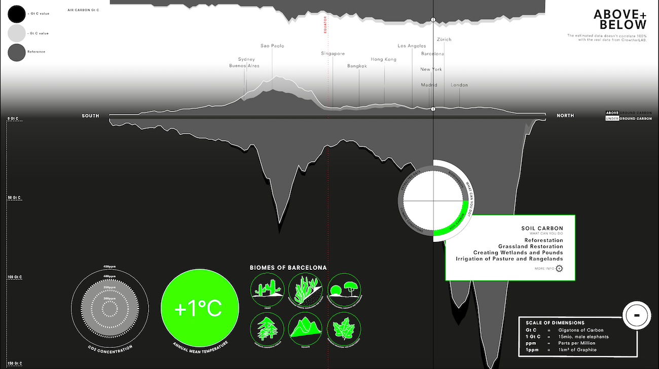
A visualisation on carbon sinks above and below earth and climate change, showing up how these are interconnected globally and the potential for change using Crowther Lab data. In a purpose to make visceral the potential there is in restoration of nature in our fight against climate change but also the dangers if we do nothing.
Interactive Visualisation Course within the BA Interaction Design at ZHdK
Mentors: Jürgen Späth, Marcial Koch
.jpeg)


Using the research and findings by the Crowther Lab on the potential of reforestation and how that could help capture atmospheric carbon and mitigate climate change1, we were tasked with creating a visualisation on a multitouch display using Tokens (IR Tracking devices) that would inspire visitors to act right away. The goal being to use the raw data collected by the lab and turning that into an interactive graphic showing up and making explorable the potential in reforestation but also its limits. Since eventually this table and the visualisations would be used in exhibitions, ideally the visitors would get involved in helping out reforestation projects in their area before leaving the table.
Above and Below shows up multiple graphs that visualise where and how the carbon is stored throughout the world. Comparing how the stocks looked in 2000, to the predicted and potential calculated futures in 2050. Using the tokens one can explore the direct impact we can have on the malleable future and how this effects the temperature in a direct way. The information token reveals more about the different latitudes, the changes predicted in the weather there and a multitude of projects that exist in those areas to already, as well as where there is still potential to create more. We hope that through this visualisation and the exploration of it, the audience is made aware of the impact that we can and will have and is showed up direct chances in how they could get involved.


Starting with the Research on the topic and how the different causes and effects are connected to choosing which aspects of this vast topic would work best to show up the problem. Creating a interaction Concept that would use the tokens effectively to allow visitor to explore the displayed data, making sure to choose the correct level of complexity to keep the visitors interested and exploring without confusing them. Then collecting and combining the raw data provided into a usable sets for our purposes and programming it into a visual with the corresponding token interactions. Making sure that all of it is accessible and easily usable and understandable on the final screen.


Above and Below won Silver at aed neuland 2021.
The competition is intended to serve as a platform for particularly talented young designers. The aim is to promote innovative and sustainable design that is characterized by the greatest possible economic as well as ecological qualities and that is functional and user-friendly at the same time, while also meeting the highest aesthetic requirements. The focus of design should always be on people and the social benefits associated with the design.
Jurystatement:
The project team of the submission "Above and Below" has dealt with an internationally very relevant topic and presents a very successful processing, visualization and interactive communication of complex data and content. The jury was very impressed by the form of interaction and the visual quality of the project. The simplicity of the representations, the playful mediation of the content and the intuitive user guidance make the handling of the data very intuitive, appealing and self-explanatory. They invite exploration and further engagement with the content.

.jpeg)


